Category Archives: Blog

The Google Mobile Penalty – Five Months On

The Google mobile penalty for non-mobile optimized websites has now been in play for over five months and we’ve taken a look at what effects it has made in this time frame. As with any changes to Google’s algorithm, some online businesses have the chance to be absolutely destroyed by changes made by Google, but this time it’s something that businesses have active control over to avoid.

google mobile penalty review

What is the Google Mobile Penalty?

The Google mobile penalty is actually straight forward. Unlike other changes to Google’s search algorithm, this one is easy to understand and easy to adjust to.

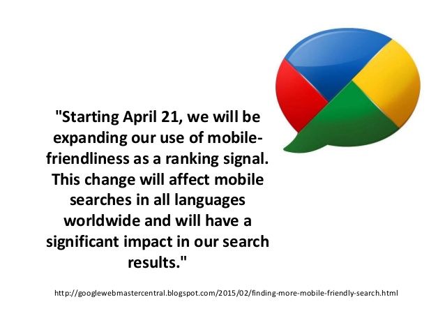
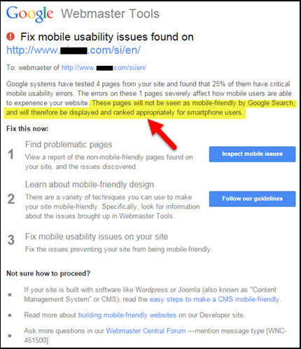
Now that mobile has become such a prevalent area of online activity, Google are pushing for a more mobile friendly web experience. As a result, any websites with web pages that are not optimized for mobile viewing will be penalized in search results. On the other hand, websites that do have a good mobile optimized experience will get pushed past any results that don’t offer the same.

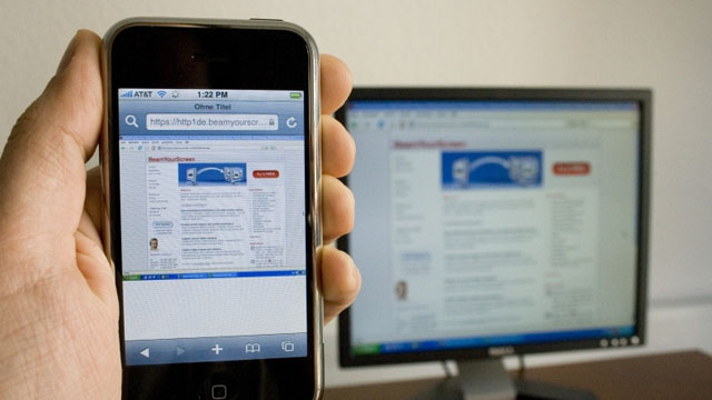
An important thing to realize, which a lot of website owners are unaware of, is that the Google mobile penalty will only apply to search results made from mobile devices. Desktop searches will remain the same.

fix mobile usability issues

The Effects of the Google Mobile Penalty Four Months on

The crazy thing about the Google mobile penalty is that it’s had a huge effect on websites across the entire globe. We’re not just talking small time websites either. A lot of top websites have had poor mobile website designs in the past and as a result this has caused them to fall off the Google search rankings.

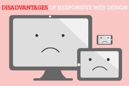
There have been three main trends following the Google mobile penalty. Firstly, a large number of non-optimized websites have been effected quite severely. As a result, a lot of non-optimized mobile websites have lost out on lots of mobile traffic.

Following on from this, websites that have managed to create a mobile optimized experience have seen a slight boost in mobile traffic. The change isn’t huge, and it’s mostly dependant on how competitor’s in that niche are performing in terms of mobile optimization.

Finally, this update has pushed a lot of businesses to create mobile friendly experiences for their websites, which is exactly what Google wanted in the first place. It’s safe to say that the Google mobile penalty has mostly done good for the internet and mobile viewership.

google mobile penalty


The Google Mobile Penalty in the Near Future

The effects of the Google mobile penalty have pretty much already taken place. With that being said, any websites that now try to work on SEO will have drastically minimized results in terms of mobile site views if the website in question has poor mobile optimization.

We’re going to see a larger push for mobile websites now that the Google mobile penalty has been made active, but some businesses are still going to be reluctant to change, perhaps due to lack of SEO knowledge or budget issues. An SEO company can usually handle these problems for you.

google mobile algorithm

Hopefully in the future we’ll see more benefits for those that do implement mobile website optimization so that mobile experiences on the web can improve and businesses that support the mobile web can benefit from it.

Need help with your websites mobile website? Contact us today.

Here’s What Google is Looking for in 2015

In this article we take a look at some of the trends Google are looking for in 2015. Sticking to these trends is bound to help your SEO efforts, and avoiding them may even have some negative consequences.

google mobile

We’ll be talking about the importance of mobile friendly websites, changes being made to support local businesses and also some details about the necessity for content.

Mobile friendly websites

If you’ve been keeping an eye on changes to Google over the last few months, you’ll already know that Google has added the mobile penalty – this is a form of search engine penalization that occurs to any websites that do not have mobile optimized web pages.

The penalty will only apply to searches made from mobile devices, but this is still a significant amount of searches and potential traffic. As a result, it’s incredibly important to create a mobile optimized website this year if you haven’t already and this is one of the biggest things that Google will be looking for in 2015.

Google Mobile Algorithm update

Once you have a mobile friendly website your chance of being seen in mobile search results will increase- you’ll jump up the search rankings, landing higher than any websites that do not have the same level of mobile optimization as you do.

Local Searches – Potential for Local Businesses

Google is making it much easier for users to search for businesses in their area. Whether they’re looking for a particular restaurant, an accounting firm, a bakery, or absolutely anything else, Google will be showing more local results than ever before.

As a result, it’s incredibly important to get your local business on Google maps so that when people perform a search in the area they’ll be able to find your business. Google has named their local business searches to My Business and understanding the workings of it can be quite difficult.

google my business

With My Business you can list details about your business, put yourself on Google Maps and provide information about opening times. This kind of information is all you’ll need to get more attention via local searches, and it’s certainly becoming a very powerful way to bring in new customers. Amazingly, it can all be completely free to set up a My Business account on Google.

More & More Content

It’s become more apparent over the last few years that creating content for your website is one of the best ways to market that website. Content marketing is becoming more popular and is in fact being seen as a first choice for marketers all over the world now that older SEO techniques are proving to be less successful.

If you want to remain relevant online, it’s important that you provide regular content about your niche. Content can be press releases, blog posts or basic details about your business and your industry. The most important thing about content marketing is that it’s unique and it’s regular.

The length and quality of your content can play a part in the success of content marketing as well, but creating content regularly is arguably the most important thing you can do in 2015 to keep your business climbing the Google rankings.

Hopefully these pieces of information will help you to keep on top of improving of your online presence in 2015.

Looking for a new online marketing strategy? Contact us today for a FREE consultation with one of our experts. Click Here

PC, Mobile and Apps Compared in 2015

In this article, we are going to be taking a look at the different areas desktop websites, mobile sites and apps can excel in, and how they all play a part of the picture that makes up a successful online business. In an ideal world, a business should be able to utilize all three, but sometimes a combination of the two is more achievable.

Where Desktop Excels

Despite all of the hype behind mobile, a desktop website still has a place in 2015. With that being said, businesses should certainly look at providing mobile optimization this year. With that in mind, desktop websites are useful for providing a good user experience to those who browse the web from a PC or laptop. Typically, desktop websites can provide a lot more information about your business. You can provide more details about your website and what you can offer to site visitors.

desktop website

Even though mobile adoption rates are through the roof right now, a lot of web traffic is still from the desktop, so it’s very important to not neglect a PC optimized experience for your customers. In fact, desktop should be treated as ‘main hub’ of sorts for your business. Your desktop should be a place where everything you need to provide to your potential customers is neatly stored.

Where Mobile Excels

Unfortunately, you aren’t always going to have a user connect to your website from a laptop or PC, and whilst desktop sites can be displayed on mobiles, they load slowly on mobile connections and they aren’t easy to navigate.

A mobile website has a number of benefits. Firstly, if a mobile user visits a page from their device, for the most part they will expect an experience that loads quickly and displays information clearly. You can use your mobile website to provide a fast loading experience that isn’t going to turn potential customers away.

easy mobile site

Mobile websites have other benefits too. By having a mobile optimized user experience your Google search rankings aren’t going to take a hit. A new change in Google’s search engine means that websites that are not optimized for mobile will be penalized, so simply having a mobile website can help your SEO efforts.

With more traffic sources being from mobile devices in 2015, it’s certainly beneficial to have a mobile website to support the current trends.

Where Apps Excel

Mobile apps are useful, but they only serve businesses in very specific cases. While you can make the argument that a business can provide an offline experience to their users, it’s rare that you’ll find a user needing to visit your website when offline, unless you provide users with some form of digital content.

mobile app advantages

Apps are great at giving users nice, streamlined access to digital content, but if you are trying to sell a product or service then apps are only as useful as a mobile website can be. Of course, if you have money for app development and you can see reasons why it’d be beneficial, then you may want to consider it, but otherwise it’s best to go for a mobile website first.

Summary

Your desktop should be treated as the main hub of your online presence, but mobile websites are also becoming very important. Whether you create a responsive website design or a separate mobile website, it’s necessary to have a mobile optimized experience in 2015. Mobile apps can be a useful asset, but mostly for digital content or other specific services

Click Here for a Mobile Preview

Tips to Turn Your Mobile Website Into a Valuable Business Asset

All the hype these days is around mobile this and mobile that, and for the most part you’re probably feeling obliged to create a mobile website or an app for your business. The trouble is, getting a mobile website developed costs money, and as a business it’s important to recuperate these costs.

make website mobile

There are ways to turn your mobile website into a valuable business asset, and eventually your mobile site will help to bring in just as much money as your desktop website. We’ll be explaining some useful things to keep in mind when trying to get profit out of your mobile site.

Improve Google Rankings

Firstly, there is about to be a big change to the way Google lists mobile optimized and non-mobile optimized websites in it’s search engine. To put it shortly, every mobile optimized website out there will be just fine, but non-optimized sites will be punished for not adapting to the latest trends.

If you have a mobile website already this is great news for you. Without even having to lift a finger, these changes will help to improve your search rankings simply because some of your competitors will not be ready to deal with the big change right away.

google mobile rankings

We’d really suggest taking advantage of the new Google search engine changes by putting a bit more effort into SEO. This is obviously going to be a big battle for many companies to retain their spots on Google, but it gives you a chance to push past those that are not so prepared.  If you aren’t sure what to do, there are many a few SEO companies that can help you out in this field.

By improving your Google rankings you are going to be setting yourself up for more traffic and more potential sales.

Bring in More Sales

It’s easy to suggest to you to work on bringing in more sales from your mobile website, but without much direction this may not be very easy. Depending on the state of your current website, your mobile site may be successfully bringing in profit, or alternatively it could be struggling to turn over a single sale.

good mobile site

If you are bringing in traffic to your mobile website, and hopefully with the new Google changes you will, there’s obviously something about your website that isn’t quite working. Mobile users are quick to act and they need content fast. For this reason, you should make sure your website loads quickly and provides visitors with the products they want to buy right away. Get rid of any unnecessary pages and information or shove it into the corner somewhere, and put the main focus of your website on the content you’re trying to sell.

Summary

If your website is responsive, loads quickly and provides quick access to the products or services you are trying to sell to customers, then you may find that your mobile website is doing successfully.

If your mobile site is under performing when compared to your desktop version you may want to take a look at your site and see how it compares to popular sites that are in the same industry as you. Chances are you’ll find some glaring issues about your website that can be fixed to increase your mobile sales.

Click Here for a Mobile Preview

How a Call to Action Should be Delivered on a Mobile Website

You might be an expert at grabbing the attention of your customers with a stylish desktop call to action, but a mobile website CTA is not the same. The way your customers browse from a mobile is a lot different to desktop browsing and for this reason you’ll need to think about how a call to action should be delivered on a mobile website successfully. This article gives some tips on how you can approach the mobile CTA problem.

mobile action

Colorful, but In-line with your Website Design

This should be common knowledge by now but a call to action on any platform should be made colorful and easy to spot. We’d suggest creating a button or banner that stands out from the rest of your website – your call to action should make everything else look tiny in comparison. Not only is this important for grabbing your visitor’s attention, but it’s also important for capturing those mobile users in a hurry that just want to make a quick buy online.

large mobile call to action

At the end of the day, you want to draw visitor’s eyes to the big button that brings them a step closer to making a purchase. However, there is a certain technique you can use so that you don’t technically have to get their attention at all, because you’ll already have it. More is explained below.

Put it Right in Front of Their Eyes

If you are creating a call to action on mobile, you should not place it in a sidebar or at the bottom of your product description. You should certainly not place a call to action at the footer of your page either. If you have something to sell, whether it be a service or a product, your call to action for this sale should be immediately available when a visitor loads up your web page.

mobile call to action

Studies show that wasting your mobile visitor’s time is going to result in a huge loss of sales. Whilst a lot of mobile users back out when a page is taking too long to load, some will also look elsewhere if they cannot find the page they need quickly. If they want to purchase a product, you should bet that your customers will want to find the call to action very quickly.

For this reason, we suggest placing a call to action as a major feature of your mobile page. If visitors are coming to your website for a certain reason, put easy access to it. Putting it as a large graphic of text banner will work, as long as it is the first thing they see when hitting your landing page.

It’s a little bit difficult if you sell multiple products or services like this because your users may be looking for different things when visiting your website. If you have your smarts about you, you could correlate data with your most popular products and place this as the first thing visitors will see when hitting your mobile website. Alternatively, if you have a sale then this could appear straight up at the front.

call to action button on mobile

A better option may be to include a parallax content slider on your website that automatically goes through a selection of your most popular products/services. Either way, it’s important that you can put your visitor’s eyes right on what you’re trying to sell as soon as they come in through the front door.

It’s not just about providing quick access to mobile users either. A study by Mobify shows that a lot of mobile sales are spontaneous – a potential customer may not come to your website to directly make a purchase, but if you can throw out your best product in front of them straight away, they may just make a quick purchase right on the spot.

Summary

In summary, it’s important to understand how to place your call to action correctly on your mobile website. Even if you go for a more traditional route that lists mobile CTAs similarly to how you would show them on your desktop website, you should still consider placing a large call to action on your front page.

Mobile users are quick to react, want instant access to products and services, and sometimes can be a little spontaneous as well. An eye-catching front page call to action can work wonders on a mobile website for this reason.

Click Here for a Mobile Preview

Five Reasons Why 2015 Is The End of the Road for Non-Mobile Business Owners

We wouldn’t say it’s entirely impossible to survive in 2015 without a mobile website, but if you run a business that relies on some form of online portal, you’re going to find 2015 is going to be a tricky year. Below, we have listed some of the main reasons why 2015 could be the end of the road for non-mobile ready business owners.

Mobile business owners

Google is Punishing Non-Optimized Websites

Perhaps the biggest and most immediate change to happen in 2015 is the Google search engine changes. Google has now made new tweaks to it’s search engine that will actively punish those website owners who do not provide a suitable and optimized experience for mobile users.

You will need a mobile or responsive website design in 2015 if you want to keep your search rankings. Otherwise, you can say goodbye to your hard earned SEO work. Businesses that are already using mobile websites are seeing success from the new Google changes because their less-prepared competitors are falling down ranks on Google.

non mobile optimized

Mobile Users are Starting to Outnumber Desktop Users

2015 will be the point where mobile users will outnumber desktop users for the first time in history. This is a pretty spectacular milestone, and whilst PC users still account for a large amount of traffic, mobile traffic is growing every single day.

The milestones made in global smartphone adoption rates this year just show that the mobile web is something you can’t ignore anymore. It may not be such an issue if mobile users didn’t rely so heavily on websites and services that provide quick-loading and easy to view mobile optimized content. However, creating a well optimized mobile website is one of the only ways to bring in mobile users.

mobile users increasing

Growth is Found Within Expanding to Mobile

More smartphone users are shopping online, browsing the internet and doing research about projects than ever before. As mobile usage grows, so does the chance to increase your profit. Owning a mobile website isn’t just about sticking to the latest trends. A mobile website can help you to increase your business’ success by a long shot, and there are plenty of methods to help grow your business and see it succeed far past your competitors by utilizing mobile traffic.

businessman using mobile phone shows internet

Support is Growing for Mobile Businesses

A few years ago, venturing into mobile technology was a scary proposition. Many analysts predicted a huge rise in mobile and smartphone usage, but it was still difficult for businesses, especially small to medium businesses to get involved with the mobile generation.

In 2015 it has become very easy to get online. There are plenty of services that can help you to develop the perfect mobile website, and thousands of other companies and individuals that are working together to make transitioning to the mobile space as a business easier.

Whether you want to create a new mobile website, develop an app or start mobile web marketing, resources on the web have never been so abundant.

mobile business support

Desktop Websites Can’t Deliver the Same User Experience

Desktop websites are great for PCs and laptops, but they just don’t cut it for mobiles and tablets. One of the best ways to provide the best user experience is to develop a responsive website design. Responsive websites can automatically adjust to different display sizes and devices, which means one website will look nice on a PC, laptop, tablet and smartphone.

Mobile websites are also useful for providing a better user experience for mobile users, and we’d even go as far as saying mobile users care more about user experience than desktop users do. You’ve probably heard studies about how a large portion of mobile users will straight up abandon your website if it isn’t well optimized, and this is very true. By not providing a great user experience for all users, you’re missing out on a lot of sales.

user experience on mobile

If you don’t have a mobile optimized website or aren’t satisfied with your current website Click Here

or

Call 1-888-736-0650

The Google Mobile Penalty – What to Expect On April 21, 2015

There’s no real way of knowing exactly what will happen with search rankings after a new Google update, but the upcoming Google mobile penalty is clearly going to have some drastic effects on non-mobile optimized web pages.

google mobile penalty

What is the Google Mobile Penalty?

Firstly, Google is set to make changes to the way it’s search engine ranks mobile optimized and non-mobile optimized websites on April 21st. At this point the whole internet could be a messy war zone. Fortunately, those who are keeping up with the times should not be affected. In fact, if you already have a mobile website you may even be affected positively by the upcoming Google update.

Here’s what Google has to say about their upcoming changes.

“Starting April 21, we will be expanding our use of mobile-friendliness as a ranking signal. This change will affect mobile searches in all languages worldwide and will have a significant impact in our search results.”

This basically means that having a well optimized website for mobile devices is going to increase your search rankings. It’s no longer going to be all about content in 2015 – having a well performing website that runs on a multitude of devices is key to having your site rank higher in Google search results.

mobile search change

What to Expect

We should expect that the new Google mobile penalty will penalize those websites that still don’t support mobile devices properly. We aren’t just talking about owning a mobile version of your site. You will need to meet a certain set of criteria to ensure your website is as mobile friendly as possible and won’t be penalized as a result.

Information provided by Google themselves lists details about what Google will be looking for. While Google doesn’t blatantly say what Google Spider will be crawling for, it’s clear that they are looking for websites that offer certain features. Your mobile website should include readable text without any need to zoom. Your page should be resized to fit the device, so responsive web design would work wonders here.

Google has provided a guide listing some of the things you should take into consideration when designing a mobile website. They have also created a mobile-friendly test that can help you to determine whether your websites are mobile friendly or not.

mobile friendly test

If you do not have a mobile friendly website or a mobile website at all, you should expect to see a drastic change in your search engine ranking. We are not sure how much of an impact it will make, but when Google suggest that not having a mobile website will have a “significant impact” you should be prepared for the absolute destruction of your hard SEO work if you don’t own a mobile friendly website.

Our Suggestion

We really suggest looking at getting a mobile website done before the changes take place to avoid any penalties. We provide a mobile development service that can create you an optimized website that fits into the criteria needed to avoid the Google mobile penalty. You can learn more about our services and what Boost One Mobile is about here.

Click Here for a Mobile Preview

Is Mobile Web Important in 2015? – A Look at the Stats

After the huge hype surrounding the recent explosion of smartphone usage over the last few years, it’s natural to be skeptical of whether the mobile web is still relevant or not. In this article, we’ll be taking a look at the current health of the mobile web, and comparing it to more traditional desktop-based internet.

mobile search stats

By taking a look at search data from some of the biggest search engines, we can have an accurate representation of what devices are being used often.

Mobile Search Results

If we take a look at Google’s traffic in the second half of 2014, we can find that on average over 16 billion monthly hits were made to the website in the US across both desktop and PC. Interestingly, the divide between platforms was split quite evenly, with roughly 8.5 billion hits coming from the desktop, and 8 billion coming from mobile devices.

When we take a look at Bing’s search results, things are a little less stable, but there is a fairly similar story to tell, although the gap was larger. In most cases, around twice as many users connected to Bing via desktop. In November 2014, for example, 400 million connected via mobile, whilst 800 million connected via desktop.

mobile search

Bing’s traffic did fluctuate a lot, but for the most part mobile traffic accounted for enough traffic to match up against ~50% of desktop traffic each month.

This information shows that desktop is still being used more for searches, but mobile is not far behind at all.

Engagement Stats

Traffic isn’t enough to tell the whole story. Next, we’ll be looking at engagement stats for both Google and Bing. Interestingly, engagement for Google was much higher on desktop than it was on mobile. Desktop traffic ended up viewing pages for three times longer, and the bounce rate was also two times lower than mobile bounce rate.

With Bing, a larger percentage of mobile users are engaging for longer than Google, but desktop is still seeing slightly higher engagement rates, with an incremental improvement on visit duration and bounce rate.

mobile engagement

What we can gather from this information is that mobile users are typically already aware of what they are searching for – once they have completed the task they had at hand, they will switch off their displays. Desktop users on the other hand may spend more time browsing as they may feel less pressured for time whilst sitting at home.

Shopping

What both the search results and engagement rates are telling us so far is that mobile is still important, but desktop is equally, or even more important than mobile so far. However, one area where mobile is taking the lead is in shopping, perhaps the most important part for most businesses.

mobile commerce shopping

While mobile isn’t quite there yet, it is slowly becoming the shopping king. In 2014, the average monthly visits for Amazon was at 634 million for mobile devices and 658.5 million for desktop. Engagement rate for Amazon on desktop was interesting – time spent on desktop was around twice as long, but pages visited and bounce rate were similar.

Mobile Google Algorithm Update

In April 2015, it is expected that Google will roll out it’s latest algorithm update. On the 21st of April, this Google update is expected to have a serious affect on the mobile search results. Google is warning that websites that are not prepared for the update will drop in rankings in the mobile search results. This means that if your site is not optimized for mobile devices, you need to fix this and fast.If your site doesn’t look good on a mobile browser (as determined by the Google crawler), expect your mobile results to drop significantly.

mobile google algorithm update

The good news is that Google has a tool to allow you to quickly see if your site is displaying properly on mobile devices. You can check that out at: https://www.google.com/webmasters/tools/mobile-friendly/

Summary

For other areas of the internet, it seems to be the same story – desktop still accounts for the majority of internet traffic, however mobile is close behind. Adoption rates for mobile is slowing down as more people become connected, but there seems to be a very healthy 50/50 split occurring between mobile and PC traffic.

So, is mobile web important in 2015? We’d definitely say so, but don’t get too carried away – desktop is just as important, if not more so than mobile, so it’s clear that your business should cater for both platforms.

We’d suggest checking out responsive website design if you are looking for the best method of entertaining both desktop and mobile users.

Looking for a mobile web developer?

Call us today at 1-888-736-0650 and speak to one of our experts.

Here’s How Businesses Benefit From the Internet of Things

Do businesses benefit from the internet of things? It’s a question that seems to be thrown around a lot recently, and not many people seem to have a solid answer for it. The internet of things, or the IoT for short, is a term used to explain the recent shift towards an internet-connected world where everything from your TV to your car can connect to the internet. In a sense, it’s a consumer driven approach that gives individuals quick access to tools, services and information.

We think it works both ways, and there should be plenty of ways your business can benefit from the IoT.

Internet of Things

More Efficient for Both Customers and Employees

If it gets to the point where individuals are given access to a constantly connected internet, it can only mean more efficiency on both sides of the fence. Firstly, customers can be more widely aware of any new activities in your business. Customers could opt-in to receive promotions from you that could be sent to their smart watch or smartphone. You can also advertise to potential clients in your area with various SEO & other online marketing efforts. Location based technology and NFC could be used to provide more relevant information to any locals that either walk past or enter your place of business.

Providing a constant connection to the internet to all of your customers will also give them the opportunity to see updates from your business in real time. They no longer have to wait to get home or reach a mobile hotspot. Wearable technology could give your customers an even faster look at notifications or promotions – for example, individuals would see content sent to their smart watch almost immediately.

internet business

Your business could also benefit from the internet of things. A near constant connection to your employees will allow you to communicate and collaborate with one another effectively without any interference. Thanks to SMS and IM messaging, things are already pretty convenient for businesses in the 21st century, but going the extra step towards a connected internet will allow you and your business partners to use online web apps and software that you can use to better collaborate with one another, no matter where you are.

New Business and Startup Potential

The shift towards the internet of things and a constant connectivity also opens up a lot of opportunities for new businesses and startups. There are many new gadgets and pieces of tech out there that are currently being designed to merge certain technology with internet connectivity. Those with a smart idea and a good knowledge of the industry could stand a good chance at making something special within the next few years.

As the concept behind the internet of things starts to mature, unique designs for technology will potentially help shape future trends. Current top manufacturers are finding it hard to put across their new innovations, and many smaller businesses are now getting exposure for showing off exciting new ideas for the internet industry.

business web marketing

Summary

Businesses will be able to benefit from the internet of things by using the connected internet to increase productivity and boost customer engagement. On another level, the shift towards a more connected world will help new businesses emerge, and give lots of potential towards startups and new businesses with innovative, unique ideas.

Looking to launch your next project? Need help achieving success with an established project? Contact us today

Why You Shouldn’t Overlook the Desktop

Everywhere you look, industry insiders, analysts and those involved with the mobile world are touting mobile web as the next big thing. It’s being heralded as the ruling form factor for browsing the internet, and it’s growth is claimed to be unrivaled.

While a lot of this is true, and there are stats to back this all up, there are many reasons why you shouldn’t overlook the desktop. Mobile may play a very vital role in the online success of your business, but the desktop is far from dead.

In fact, we believe that the standard web should be catered for just as much as mobile web, and in this article we’ll explain a few reasons why.

Desktop vs Mobile

Not Everybody is Connected

While the big dream is to have everybody the happy owner of a smartphone, it’s still not something we’ve achieved yet. Yes, there are many people that now own smartphones, but there is still a large portion of internet-connected individuals that do not have a smartphone.

It’s also important to account for the smartphone owners that do not use mobile web on their devices – combine these people with those that do not own a smartphone, and the numbers start to rack up.

Just like you would miss out on mobile users if you didn’t provide a mobile website for your business, you’d also be missing out on desktop-only users if you decided to focus solely on the mobile web.

Laptop Use

Laptops and PCs are still Widely Used

Even though many smartphone owners access the internet from their mobile devices, it doesn’t mean they do not use other internet-connected devices either. The wide range of internet-connected devices gives many people many different portals to access the internet from. In most cases, there may be a main device an individual may use, and their other internet-connected devices, such as smartphones, are used for quick searches or other tasks while away from their main device.

In a lot of cases, smartphone owners will spend a lot of time browsing the internet from their laptop or PC while at home. So although the hype of the mobile web is very real, the desktop is not going anyway – people are going to use laptops and PCs for years to come.

The Solution

It may sound like a lot of effort trying to split your efforts between the desktop and mobile web. In some cases, it can be, and it could be doubly expensive maintaining both versions of your website.

Fortunately there is a solution. Responsive websites are a great option for people who’d like their websites viewed on multiple form factors. A responsive web page will adjust to whatever device it is being used on automatically. For instance, it will appear as mobile-friendly as possible when viewed on a smartphone, but it will change it’s appearance when loaded on a desktop browser.

responsive web

Responsive websites are the simple option because they offer one streamlined experience that users can access from anywhere. More importantly, responsive websites are packed into one single domain, so you’ll be able to save on development and hosting costs.

For more information on responsive web sites and what they can do for you, contact us today.

What Devices Are Used Most? – Interesting Internet Stats

As the internet has evolved to support more web-ready devices, the way users interact with the internet has changed. More users are connecting via different platforms than ever before, and as a business it is important to understand where connections are coming from.

It’s easy to assume that desktop and mobile account for the biggest chunk of internet users, but there are other platforms to consider, and the numbers behind what platforms are being used may help you to form important business decisions.

many web browsing devices

Internet Percentages

Nielsen recently did a study to analyze certain stats about internet usage across various types of devices. One of the major areas that the study looked at was video and movie streaming. Considering places like Netflix and Hulu make up a very large portion of the entire internet traffic, looking at device usage stats on these platforms can give you an idea about what people are using.

Netflix and Hulu are also supported by many internet connected devices, so this gives us a better picture of where users are connecting to the internet from. The largest percent of Netflix and Hulu users were shown to have connected via PC, with 44% and 43% going towards Netflix and Hulu respectively.

Quite a long way behind PC was mobile phones, or smart phones, with 23% and 17% of traffic. Tablets made up for another 14 and 15%, which would give the overall ‘mobile’ category around 30% of the entire Netflix and Hulu traffic. We already know that mobile phone traffic is greater than ever, but it seems the Tablet is inching closer and closer.

browsing on tablet

Interestingly, both the Xbox 360 and PS3 took between 10% and 16% across both platforms, and smart TVs also took between 14% and 17% of traffic. The Wii had a strangely large 21% for Hulu, and 13% for Netflix. Finally, internet connected Blu-ray players and TV-connected computers accounted for between 13% and 17% each, across both platforms.

It’s clear that internet usage patterns would change depending on what websites or online content is being accessed, and we can take a look at other studies to confirm this. In a similar Nielsen study, monthly social media time was reported to be 6 hours and 24 minutes via a PC or laptop for Facebook. Tablet Facebook usage was at 7 hours and 43 minutes for Facebook, whilst smartphone users only visited Facebook for around 40 minutes per month.

Tablet devices also took the most Twitter time with 3 hours, 7 minutes, whilst PC took just 36 minutes per month, and smartphones took 11 minutes per month.

The Results

What this data shows is that many people use their devices for different situations and every business needs a website that will adapt to these different situations automatically. It is possible that many of the same people who browse Twitter and Facebook for so long on their tablet also fit into the same group that use desktop to view Netflix.

Many devices are used for different scenarios, and even smart TVs and game consoles are now more internet connected than ever before. As a business owner who may be looking to get up to speed online, it’s very important to understand the wide variety of devices that connect to the internet on a daily basis.

responsive resolutions

Because of the range of devices from smartphones to smart TVs, it’s hard to provide for all of these devices simultaneously. The solution that can save money, effort and time is to look into finding a responsive website design for your business’ web page. A responsive web design will adapt automatically, according to the screen size of the device it is being displayed on.

If you’re looking for a new website, and are looking for experts who are familiar with all devices, Click Here to contact us!

The One Web Solution for Tablets, Smartphones and Desktops

A one web solution involves a website that can be optimized for multiple form factors at once – it’s a responsive web design that can save businesses money as it only takes one development process, but it can be used for a variety of different devices, including tablets, smartphones and desktop PCs. In this article we are taking a look at a few of the reasons why a one web solution can prove to be incredibly handy.

one web solution

What Exactly is The One Web Solution?

In the last few years, it has become increasingly clear that multiple web-capable devices have been widely adopted into society. While this makes it inherently easier for individuals to access the web and for online businesses to thrive, it has created a kind of device fragmentation.

In practice, when a web users views a desktop website from their mobile, the page is often unresponsive or has flaws – some features may not display properly, and some components will be hard to access from a small touch screen display. Alternatively, a mobile web page viewed from a desktop website may look limited and be incapable of providing enough content for those surfing the web.

The one web solution involves developing a website that can ‘transform’ when viewed on different devices – these kinds of websites work flawlessly on all platforms, including smartphones, desktops, or tablets.

Another word for the one web solution is known as responsive website design, and over the last few years, many businesses have started to offer responsive website development.

benefits of responsive

The Benefits of the One Web Solution

So how can the one web solution benefit online businesses? If it hasn’t been made clear already, many mobile devices have problems with loading and displaying full sized desktop websites properly, and while mobile websites offer a great solution for this, they are very not advisable for use on desktop websites.

This leaves two choice for an up-to-date business: they can either develop a mobile website and a desktop website, or simply create a brand new responsive website design that uses the elements of the one web solution to save time and money on development.

Time is saved because only one website is needed, and this website can be adapted to multiple platforms. From a business standpoint, there is rarely a better alternative, and unless you’ve got a highly complicated set of needs for your mobile or desktop version of your website, the one web solution can help make site viewer’s experiences as good as they possibly can be.

website responsive advantages

Improving customer experience is one of the oldest methods of customer retention, and the one web solution will be able to achieve your customer retention goals whilst saving money at the same time.


Summary

In summary, the one web solution can save you development time and money whilst improving customer experience.

  • Generally Costs Less to Develop Than a Traditional Mobile and Desktop Web Combo
  • Takes half as much maintenance Work
  • Is Future-proof for New Form Factors

Kills Two Birds with One Stone By Improving Customer Experience for Both Mobile and Desktop Viewers

Click Here to Get Started

eCommerce vs Mcommerce – the Stats Compared, and why Mobile is Winning

The consumer world has been ruled by the internet over the last decade, but since smartphone usage has been on a rise, mobile shopping has started to become more relevant than standard web shopping. In this article, we put the two methods of shopping against each other to see which one offers the best results, and share the predictions we have for both methods in the near future. It’s eCommerce vs Mcommerce, and they’re both putting up a good fight.

ecommerce vs mcommerce

Looking at Different Usage Scenarios

Before we take a look at different stats that help resolve the eCommerce vs mCommerce battle, we’re going to be explaining the different usage scenarios for both methods, giving examples why each method can be beneficial to a shopper, and when each user typically uses each method.

If a shopper has the choice between eCommerce and mCommerce, they may choose a different approach each time, depending on their current circumstances. Typically, Mcommerce is used for quick purchases – mobile web pages load blazingly fast, and they are made for allowing users to complete tasks quickly. If your customers are expected to search and buy one product from you, Mcommerce is useful because they will be able to quickly buy the product they are looking for.

If you’d rather your customers do a bit of shopping around while considering what to buy, standard eCommerce can be more beneficial, as you can display more deals, provide product listings and give information about your business to shoppers. Typically, shoppers will take the desktop route if they are unsure about the product they’d like to buy, and would like to do a bit of research first.

These are obviously just two very typical usage scenarios, but the point made here is that both methods of web commerce offer different uses for shoppers.

 m commerce examples

What Do the Stats Say?

So, the question that I’m sure you’d like answered – Do I put more effort into eCommerce or Mcommerce? It really will depend on your situation, but the stats show that mCommerce is easily as effective as eCommerce, and if you haven’t provided a mobile web optimized shopping page and you rely on online sales, then we’d definitely suggest getting a mobile web store developed. Get a free preview of what your site could look like here.

It’s important to realize that while mCommerce is growing at a staggering rate, standard eCommerce is still as healthy as ever. According to a study, around 51% of users have used their smartphones to make an online purchase, but the same study expects that around 54% of all sales will be eCommerce this year. This suggests that while a large number of shoppers have used their smartphone to do shopping in the past, a slightly larger amount of people use either just standard web shopping or a mixture of web and mobile based shopping regularly.

As a business, it’s important to adapt to the era of mobile, but while a mobile web store will help, don’t neglect your desktop based shop either – there’s an even split between eCommerce and mCommerce, and you’ll need to cover both bases efficiently to bring in as much revenue from sales as possible. Need a new website? Get one built that will adapt to desktop, mobile and Tablet. Click here to get started

Are Mobile Websites Useful? – Here’s Proof

You may have been told time and time again to update your website to something more mobile friendly, but after hearing all of this advice, one very important question seems to arise above others – are mobile websites useful? From a business perspective, there are many reasons why mobile websites could be useful, but instead of giving information as to why, we’ll be sticking with the facts to show exactly how you could personally benefit from a mobile optimized web page.

mobile site proof

The Potential in Mobile Users

Before we even take a look at why mobile websites may be better for mobile devices than a standard desktop website, let’s take a look at how much potential there is within mobile users. According to research, almost half of all internet users are browsing the internet via their mobile device.

While this may not grasp numbers on the entire population, it does a good example of explaining how internet users in developed countries are relying more on their mobile devices instead of their laptop or PC.

mobile sites useful

Some mobile users may use internet from both a mobile device and a desktop device, but it is important to realize that a large chunk of these users will only use mobile for browsing the internet. That means there is a large chunk of potential customers browsing from their smartphone.

Not only this, but according to a study, 4 out of 5 US shoppers use their mobile devices to shop, and by the end of this year, US mobile internet usage is predicted to overtake desktop usage.

Why a Mobile Website is Useful

So now that we know just how large the mobile user base is, let’s take a look at answering our original question – are mobile websites useful?

Our answer is yes, and here’s why.

It is all about load times and optimization – mobile users are fast paced and quick to act – they want information on their smartphone quickly, and if it isn’t found quickly, they won’t wait around, they will look elsewhere.

mobile consumers

This could be for a few reasons – firstly, they may be using a Wifi hotspot, (usage has increased seven fold since 2011) and they might have limited time in the area to conduct a search. Secondly, they may be on a slow 2G or 3G connection that struggles loading web pages with a lot of data on.

Thirdly, they may be on a data cap, and slow load speeds suggests that your website is packed with data, all of which is going to drain a mobile user’s data allowance to a minimum.

So, how does using a desktop website instead of a mobile one affect you or your business? It’s simple – For every second a mobile user is waiting for your page to load, or for every second a user is searching for content, you are losing sales.

In fact, recent studies show that one single second of extra load time will decrease conversions by 7%, a 16% decrease in customer satisfaction, and 11% fewer page views.

By creating a mobile website for your business, you are reducing load times and providing users with instant access to what they are looking for – this here is why mobile websites are useful. Every extra second cut off of load time and on-site browsing earns you customers, ultimately leading to more sales in the future.

Responsive Website Design – Pros & Cons

For those unaware, responsive website design is a form of website that can easily adapt to any form factor the website is displayed on. Whether it’s on a tablet, a smartphone or a desktop PC, a responsive website will work fluidly to display content to it’s visitors.

responsive web

There are both pros and cons to acquiring a responsive web design for your business, and in this article we are weighing out both the positives and negatives to find out whether it’s worth it to invest in getting such a website.

Pros of Responsive Website Design

Perhaps one of the biggest reasons why responsive website design is always going to be useful is that it is easily adapted to the mobile space – the mobile industry is absolutely huge right now, and a lot more people are using their smartphones and tablets to do shopping, watch videos and browse the internet.

advantages of responsive

As a business, or an individual who is looking to increase their website viewership, there is no doubt that having a website that is fluid on mobile devices is absolutely vital to bringing in more leads. If your website isn’t optimized for mobile devices, then there is a good chance that mobile viewers will leave your website quickly to find a more optimized alternative.

If you are looking into creating a mobile experience for your viewers or customers, picking out a website that is optimized for both mobile and the desktop will save you development costs and time – you will not need to develop two separate experiences.

Cons of Responsive Website Design

Responsive website isn’t perfect – there are some drawbacks, but typically these cons can be worked around. Perhaps one of the more persistent issues with a mobile and desktop optimized site is that it can be hard to provide all of the content to your users via desktop – typical PC optimized websites work much better than responsive web design for providing all information to users on one single page.

cons of responsive design

On top of this, it can sometimes be quite hard to code in certain features to your website that will work efficiently on both mobile and desktop versions of your site.

While mobile websites are designed towards providing viewers with the content or services they are looking for as quickly as possible, this is usually not the case with desktop websites. By creating a universal design for both mobile and the desktop you are sacrificing some of that PC functionality for a more streamlined mobile experience.

Summary

Responsive website design is perfect for appealing to a large audience as easily as possible, however, if there are certain features you may want on your desktop website that just won’t work on a responsive site, you may need to look into getting a separate mobile optimized website instead.

Pros –

–       Great for introducing mobile viewers to your website

–       Takes less development time/cost

–       Website is fluid on all devices

Cons –

–       A bit of desktop functionality is lost

–      You will have to re-design your entire website, which may be confusing for some current users


To find out more about our responsive web design, Call 1-888-736-0650 or request a free web design quote