Whether you’re hiring a developer to do it for you, or you are doing it yourself, there are certain things you should consider before starting mobile website development. Make sure you are clear about the kind of website you want before the development gets started, and be sure to integrate key features every mobile website needs.
Read below to get the best tips for better mobile website development.
Better Functionality
To ensure your mobile website works well on a mobile device, there are a few pitfalls you should avoid, and some tips you should take into consideration.
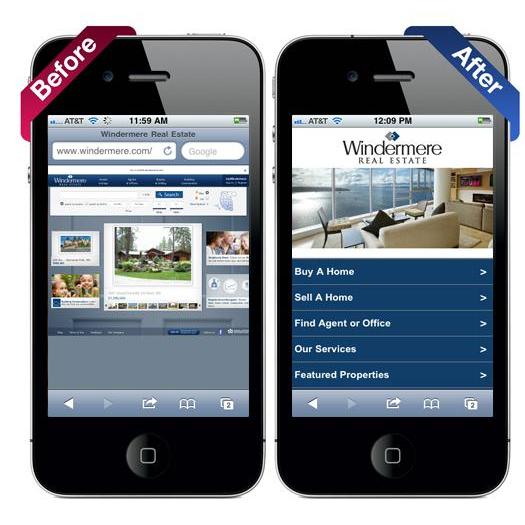
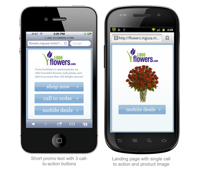
For example, it’s very important not to clutter your mobile website with too much embedded content, website information or rich content relating to your website. A well designed mobile website will have a few simple features right on the front page, and have the rest of the website put out of the way inside menus and other links. To avoid long loading times, badly optimized home pages and other dilemmas, the front page should be used for things your visitors are most likely going to be looking for, and that’s it. To see some of the best mobile site designs click here.
When working on mobile website development, creating a simple, yet intuitive home page will be a much better alternative to a feature-filled page filled with content because it is easy to read on a small device, loads quickly, and provides the visitor with the things they are most likely going to be looking for on the front page.
Better Appearance
Making things simple also helps with the appearance, and this is also another area to take into consideration when planning the website design.
If you have hired a business or a developer to work on your mobile site, be clear that you want a clean and easy-to-read appearance for your website, and don’t accept anything that doesn’t look intuitive and easy to use on a mobile handset.
If you are developing a mobile website on your own, take a look at other professional mobile websites to get an idea about the simplicity behind each website. They are usually very plain and use simple block colours to add a bit of life to them, but with every good example of a mobile website, you will always see simple and often minimalistic designs.
Integrating more Features
While it is important to keep things simple, you’ll be leaving out missed opportunities if you don’t include some key features into your mobile website.
Because you are developing for mobile devices, you will want to provide content and appropriate links to content that most mobile users will make use of.
For example, you could include small buttons that link to social profiles such as Twitter or Facebook, or, if you have a physical location for your business, an integrated Google maps feature that gives directions straight to your business’ location by using the visitor’s GPS on their smartphone.
When working on mobile website project, make sure to take inspiration from other mobile websites and look at the features they’ve included. Any feature that can make things easier and quicker for your visitors is usually a good feature to use, and the quicker you can hand feed your visitors with the content they are looking for, the better. Need a mobile friendly version of your website? Contact us today.