You might be an expert at grabbing the attention of your customers with a stylish desktop call to action, but a mobile website CTA is not the same. The way your customers browse from a mobile is a lot different to desktop browsing and for this reason you’ll need to think about how a call to action should be delivered on a mobile website successfully. This article gives some tips on how you can approach the mobile CTA problem.
Colorful, but In-line with your Website Design
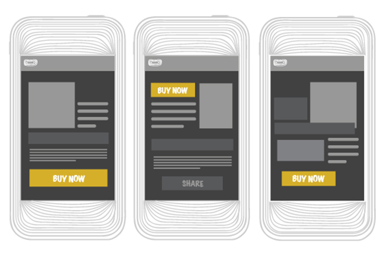
This should be common knowledge by now but a call to action on any platform should be made colorful and easy to spot. We’d suggest creating a button or banner that stands out from the rest of your website – your call to action should make everything else look tiny in comparison. Not only is this important for grabbing your visitor’s attention, but it’s also important for capturing those mobile users in a hurry that just want to make a quick buy online.
At the end of the day, you want to draw visitor’s eyes to the big button that brings them a step closer to making a purchase. However, there is a certain technique you can use so that you don’t technically have to get their attention at all, because you’ll already have it. More is explained below.
Put it Right in Front of Their Eyes
If you are creating a call to action on mobile, you should not place it in a sidebar or at the bottom of your product description. You should certainly not place a call to action at the footer of your page either. If you have something to sell, whether it be a service or a product, your call to action for this sale should be immediately available when a visitor loads up your web page.
Studies show that wasting your mobile visitor’s time is going to result in a huge loss of sales. Whilst a lot of mobile users back out when a page is taking too long to load, some will also look elsewhere if they cannot find the page they need quickly. If they want to purchase a product, you should bet that your customers will want to find the call to action very quickly.
For this reason, we suggest placing a call to action as a major feature of your mobile page. If visitors are coming to your website for a certain reason, put easy access to it. Putting it as a large graphic of text banner will work, as long as it is the first thing they see when hitting your landing page.
It’s a little bit difficult if you sell multiple products or services like this because your users may be looking for different things when visiting your website. If you have your smarts about you, you could correlate data with your most popular products and place this as the first thing visitors will see when hitting your mobile website. Alternatively, if you have a sale then this could appear straight up at the front.

A better option may be to include a parallax content slider on your website that automatically goes through a selection of your most popular products/services. Either way, it’s important that you can put your visitor’s eyes right on what you’re trying to sell as soon as they come in through the front door.
It’s not just about providing quick access to mobile users either. A study by Mobify shows that a lot of mobile sales are spontaneous – a potential customer may not come to your website to directly make a purchase, but if you can throw out your best product in front of them straight away, they may just make a quick purchase right on the spot.
Summary
In summary, it’s important to understand how to place your call to action correctly on your mobile website. Even if you go for a more traditional route that lists mobile CTAs similarly to how you would show them on your desktop website, you should still consider placing a large call to action on your front page.
Mobile users are quick to react, want instant access to products and services, and sometimes can be a little spontaneous as well. An eye-catching front page call to action can work wonders on a mobile website for this reason.