Category Archives: Responsive Web Design

Is Mobile Web Important in 2015? – A Look at the Stats

After the huge hype surrounding the recent explosion of smartphone usage over the last few years, it’s natural to be skeptical of whether the mobile web is still relevant or not. In this article, we’ll be taking a look at the current health of the mobile web, and comparing it to more traditional desktop-based internet.

mobile search stats

By taking a look at search data from some of the biggest search engines, we can have an accurate representation of what devices are being used often.

Mobile Search Results

If we take a look at Google’s traffic in the second half of 2014, we can find that on average over 16 billion monthly hits were made to the website in the US across both desktop and PC. Interestingly, the divide between platforms was split quite evenly, with roughly 8.5 billion hits coming from the desktop, and 8 billion coming from mobile devices.

When we take a look at Bing’s search results, things are a little less stable, but there is a fairly similar story to tell, although the gap was larger. In most cases, around twice as many users connected to Bing via desktop. In November 2014, for example, 400 million connected via mobile, whilst 800 million connected via desktop.

mobile search

Bing’s traffic did fluctuate a lot, but for the most part mobile traffic accounted for enough traffic to match up against ~50% of desktop traffic each month.

This information shows that desktop is still being used more for searches, but mobile is not far behind at all.

Engagement Stats

Traffic isn’t enough to tell the whole story. Next, we’ll be looking at engagement stats for both Google and Bing. Interestingly, engagement for Google was much higher on desktop than it was on mobile. Desktop traffic ended up viewing pages for three times longer, and the bounce rate was also two times lower than mobile bounce rate.

With Bing, a larger percentage of mobile users are engaging for longer than Google, but desktop is still seeing slightly higher engagement rates, with an incremental improvement on visit duration and bounce rate.

mobile engagement

What we can gather from this information is that mobile users are typically already aware of what they are searching for – once they have completed the task they had at hand, they will switch off their displays. Desktop users on the other hand may spend more time browsing as they may feel less pressured for time whilst sitting at home.

Shopping

What both the search results and engagement rates are telling us so far is that mobile is still important, but desktop is equally, or even more important than mobile so far. However, one area where mobile is taking the lead is in shopping, perhaps the most important part for most businesses.

mobile commerce shopping

While mobile isn’t quite there yet, it is slowly becoming the shopping king. In 2014, the average monthly visits for Amazon was at 634 million for mobile devices and 658.5 million for desktop. Engagement rate for Amazon on desktop was interesting – time spent on desktop was around twice as long, but pages visited and bounce rate were similar.

Mobile Google Algorithm Update

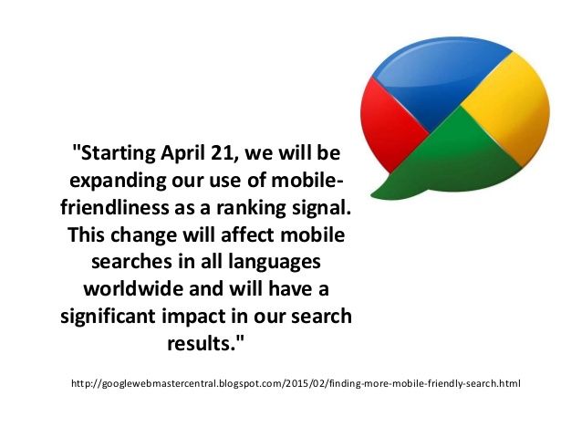
In April 2015, it is expected that Google will roll out it’s latest algorithm update. On the 21st of April, this Google update is expected to have a serious affect on the mobile search results. Google is warning that websites that are not prepared for the update will drop in rankings in the mobile search results. This means that if your site is not optimized for mobile devices, you need to fix this and fast.If your site doesn’t look good on a mobile browser (as determined by the Google crawler), expect your mobile results to drop significantly.

mobile google algorithm update

The good news is that Google has a tool to allow you to quickly see if your site is displaying properly on mobile devices. You can check that out at: https://www.google.com/webmasters/tools/mobile-friendly/

Summary

For other areas of the internet, it seems to be the same story – desktop still accounts for the majority of internet traffic, however mobile is close behind. Adoption rates for mobile is slowing down as more people become connected, but there seems to be a very healthy 50/50 split occurring between mobile and PC traffic.

So, is mobile web important in 2015? We’d definitely say so, but don’t get too carried away – desktop is just as important, if not more so than mobile, so it’s clear that your business should cater for both platforms.

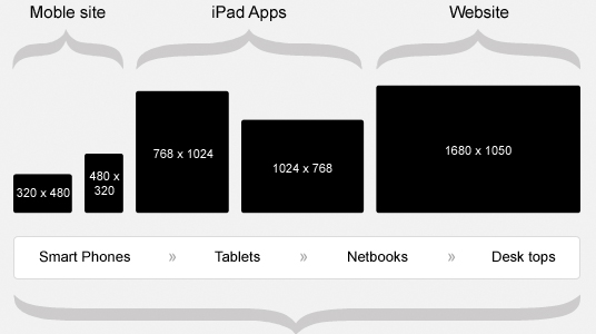
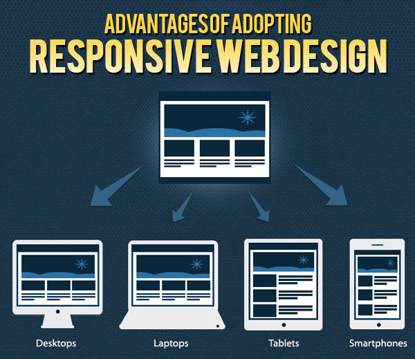
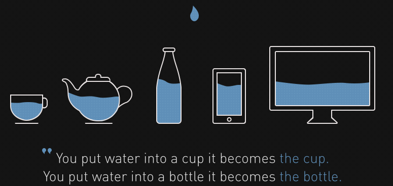
We’d suggest checking out responsive website design if you are looking for the best method of entertaining both desktop and mobile users.

Looking for a mobile web developer?

Call us today at 1-888-736-0650 and speak to one of our experts.

Why You Shouldn’t Overlook the Desktop

Everywhere you look, industry insiders, analysts and those involved with the mobile world are touting mobile web as the next big thing. It’s being heralded as the ruling form factor for browsing the internet, and it’s growth is claimed to be unrivaled.

While a lot of this is true, and there are stats to back this all up, there are many reasons why you shouldn’t overlook the desktop. Mobile may play a very vital role in the online success of your business, but the desktop is far from dead.

In fact, we believe that the standard web should be catered for just as much as mobile web, and in this article we’ll explain a few reasons why.

Desktop vs Mobile

Not Everybody is Connected

While the big dream is to have everybody the happy owner of a smartphone, it’s still not something we’ve achieved yet. Yes, there are many people that now own smartphones, but there is still a large portion of internet-connected individuals that do not have a smartphone.

It’s also important to account for the smartphone owners that do not use mobile web on their devices – combine these people with those that do not own a smartphone, and the numbers start to rack up.

Just like you would miss out on mobile users if you didn’t provide a mobile website for your business, you’d also be missing out on desktop-only users if you decided to focus solely on the mobile web.

Laptop Use

Laptops and PCs are still Widely Used

Even though many smartphone owners access the internet from their mobile devices, it doesn’t mean they do not use other internet-connected devices either. The wide range of internet-connected devices gives many people many different portals to access the internet from. In most cases, there may be a main device an individual may use, and their other internet-connected devices, such as smartphones, are used for quick searches or other tasks while away from their main device.

In a lot of cases, smartphone owners will spend a lot of time browsing the internet from their laptop or PC while at home. So although the hype of the mobile web is very real, the desktop is not going anyway – people are going to use laptops and PCs for years to come.

The Solution

It may sound like a lot of effort trying to split your efforts between the desktop and mobile web. In some cases, it can be, and it could be doubly expensive maintaining both versions of your website.

Fortunately there is a solution. Responsive websites are a great option for people who’d like their websites viewed on multiple form factors. A responsive web page will adjust to whatever device it is being used on automatically. For instance, it will appear as mobile-friendly as possible when viewed on a smartphone, but it will change it’s appearance when loaded on a desktop browser.

responsive web

Responsive websites are the simple option because they offer one streamlined experience that users can access from anywhere. More importantly, responsive websites are packed into one single domain, so you’ll be able to save on development and hosting costs.

For more information on responsive web sites and what they can do for you, contact us today.

What Devices Are Used Most? – Interesting Internet Stats

As the internet has evolved to support more web-ready devices, the way users interact with the internet has changed. More users are connecting via different platforms than ever before, and as a business it is important to understand where connections are coming from.

It’s easy to assume that desktop and mobile account for the biggest chunk of internet users, but there are other platforms to consider, and the numbers behind what platforms are being used may help you to form important business decisions.

many web browsing devices

Internet Percentages

Nielsen recently did a study to analyze certain stats about internet usage across various types of devices. One of the major areas that the study looked at was video and movie streaming. Considering places like Netflix and Hulu make up a very large portion of the entire internet traffic, looking at device usage stats on these platforms can give you an idea about what people are using.

Netflix and Hulu are also supported by many internet connected devices, so this gives us a better picture of where users are connecting to the internet from. The largest percent of Netflix and Hulu users were shown to have connected via PC, with 44% and 43% going towards Netflix and Hulu respectively.

Quite a long way behind PC was mobile phones, or smart phones, with 23% and 17% of traffic. Tablets made up for another 14 and 15%, which would give the overall ‘mobile’ category around 30% of the entire Netflix and Hulu traffic. We already know that mobile phone traffic is greater than ever, but it seems the Tablet is inching closer and closer.

browsing on tablet

Interestingly, both the Xbox 360 and PS3 took between 10% and 16% across both platforms, and smart TVs also took between 14% and 17% of traffic. The Wii had a strangely large 21% for Hulu, and 13% for Netflix. Finally, internet connected Blu-ray players and TV-connected computers accounted for between 13% and 17% each, across both platforms.

It’s clear that internet usage patterns would change depending on what websites or online content is being accessed, and we can take a look at other studies to confirm this. In a similar Nielsen study, monthly social media time was reported to be 6 hours and 24 minutes via a PC or laptop for Facebook. Tablet Facebook usage was at 7 hours and 43 minutes for Facebook, whilst smartphone users only visited Facebook for around 40 minutes per month.

Tablet devices also took the most Twitter time with 3 hours, 7 minutes, whilst PC took just 36 minutes per month, and smartphones took 11 minutes per month.

The Results

What this data shows is that many people use their devices for different situations and every business needs a website that will adapt to these different situations automatically. It is possible that many of the same people who browse Twitter and Facebook for so long on their tablet also fit into the same group that use desktop to view Netflix.

Many devices are used for different scenarios, and even smart TVs and game consoles are now more internet connected than ever before. As a business owner who may be looking to get up to speed online, it’s very important to understand the wide variety of devices that connect to the internet on a daily basis.

responsive resolutions

Because of the range of devices from smartphones to smart TVs, it’s hard to provide for all of these devices simultaneously. The solution that can save money, effort and time is to look into finding a responsive website design for your business’ web page. A responsive web design will adapt automatically, according to the screen size of the device it is being displayed on.

If you’re looking for a new website, and are looking for experts who are familiar with all devices, Click Here to contact us!

The One Web Solution for Tablets, Smartphones and Desktops

A one web solution involves a website that can be optimized for multiple form factors at once – it’s a responsive web design that can save businesses money as it only takes one development process, but it can be used for a variety of different devices, including tablets, smartphones and desktop PCs. In this article we are taking a look at a few of the reasons why a one web solution can prove to be incredibly handy.

one web solution

What Exactly is The One Web Solution?

In the last few years, it has become increasingly clear that multiple web-capable devices have been widely adopted into society. While this makes it inherently easier for individuals to access the web and for online businesses to thrive, it has created a kind of device fragmentation.

In practice, when a web users views a desktop website from their mobile, the page is often unresponsive or has flaws – some features may not display properly, and some components will be hard to access from a small touch screen display. Alternatively, a mobile web page viewed from a desktop website may look limited and be incapable of providing enough content for those surfing the web.

The one web solution involves developing a website that can ‘transform’ when viewed on different devices – these kinds of websites work flawlessly on all platforms, including smartphones, desktops, or tablets.

Another word for the one web solution is known as responsive website design, and over the last few years, many businesses have started to offer responsive website development.

benefits of responsive

The Benefits of the One Web Solution

So how can the one web solution benefit online businesses? If it hasn’t been made clear already, many mobile devices have problems with loading and displaying full sized desktop websites properly, and while mobile websites offer a great solution for this, they are very not advisable for use on desktop websites.

This leaves two choice for an up-to-date business: they can either develop a mobile website and a desktop website, or simply create a brand new responsive website design that uses the elements of the one web solution to save time and money on development.

Time is saved because only one website is needed, and this website can be adapted to multiple platforms. From a business standpoint, there is rarely a better alternative, and unless you’ve got a highly complicated set of needs for your mobile or desktop version of your website, the one web solution can help make site viewer’s experiences as good as they possibly can be.

website responsive advantages

Improving customer experience is one of the oldest methods of customer retention, and the one web solution will be able to achieve your customer retention goals whilst saving money at the same time.


Summary

In summary, the one web solution can save you development time and money whilst improving customer experience.

  • Generally Costs Less to Develop Than a Traditional Mobile and Desktop Web Combo
  • Takes half as much maintenance Work
  • Is Future-proof for New Form Factors

Kills Two Birds with One Stone By Improving Customer Experience for Both Mobile and Desktop Viewers

Click Here to Get Started