If you’re looking for a good mobile website design for your own site, there are many places to gather ideas and gain inspiration from, and there are plenty of different methods to get you thinking big. As strange as it may seem, when it comes to mobile website design, thinking big usually involves trying to fit all of your website’s functionality into the most small and simplistic package, which should be made to be more suitable for browsing from a mobile device.
Since the mobile generation is still quite new, there is a lot of growing space to be done, and because of this, no one has yet developed the perfect mobile website. However, there are a few different types of mobile website design that stand out from the others, and these work pretty well.
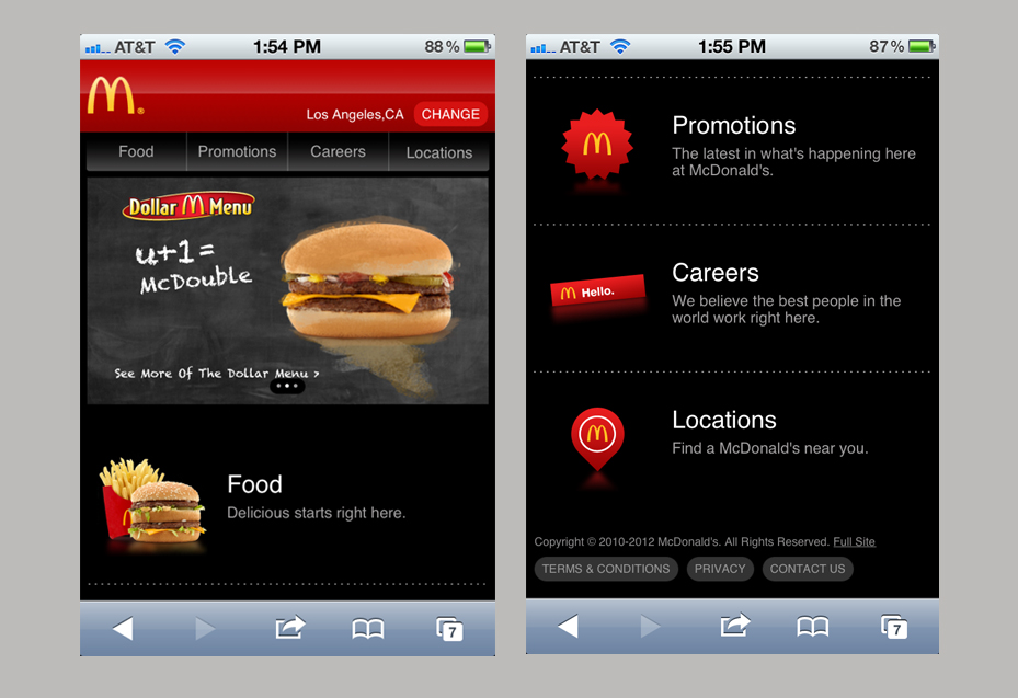
The Tabbed Menu Design
If you have a feature-heavy website, the tabbed menu design is a perfect way to sweep all of those features under a “carpet” so that the main website has the bare minimum available right away.
A good example of the tabbed menu design is the mobile Facebook website. On this website, you have your news feed displaying on the main area of the page, and three links at the top for your notifications, friend requests and messages.
However, on top of this, there are dozens of other options and links which can be accessed from the tabbed menu from the top left. When tapped, a draw will open with more features in.
The tabbed menu design is also a good design for websites that allow viewers to have their own personal profile page, because you can provide all of their content within this tabbed menu too.
Simple Block Colors
If you don’t have much on display, a good mobile website design would be the simple block color website design. A good example of this would be the mobile version of Hotukdeals. On this website, most of the screen space will be used for a news feed, new business information, articles or news, depending on what your website offers.
At the top, there are usually a row of links which lead to the content users are most looking for. Things such as contact details, business information and other important information related to your website should be here.
At the bottom of the website, most simple block mobile templates have more links and information that users may not need right away. Things such as contact pages for other businesses, advertising space, and perhaps even social networking links could be placed down here.
Infinite Posts Design
Websites that are based around journalism or blogging, or other websites that are updated multiple times a day will work well with an infinite posts mobile website design. This design has an infinite scrolling page that can constantly load new content each time the user scrolls to the bottom.
Typically, posts will be ordered by the time of posting, but most websites that are designed like this have filter options so users can find specific types of posts, or put posts in a different order such as “most viewed” or “most shared.” A good example of this would be the mobile website for Android Authority .
This kind of design can also have a row of links at the top, but other than that information and content is usually kept to a minimum.
These are usually the main three types of mobile website design that you will see available, and they’ve been proven to work quite efficiently. If you’re still unsure of a design for your website, have a browse online to get inspiration from other mobile web pages.