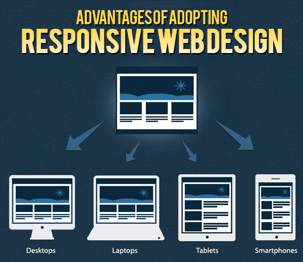
A one web solution involves a website that can be optimized for multiple form factors at once – it’s a responsive web design that can save businesses money as it only takes one development process, but it can be used for a variety of different devices, including tablets, smartphones and desktop PCs. In this article we are taking a look at a few of the reasons why a one web solution can prove to be incredibly handy.
What Exactly is The One Web Solution?
In the last few years, it has become increasingly clear that multiple web-capable devices have been widely adopted into society. While this makes it inherently easier for individuals to access the web and for online businesses to thrive, it has created a kind of device fragmentation.
In practice, when a web users views a desktop website from their mobile, the page is often unresponsive or has flaws – some features may not display properly, and some components will be hard to access from a small touch screen display. Alternatively, a mobile web page viewed from a desktop website may look limited and be incapable of providing enough content for those surfing the web.
The one web solution involves developing a website that can ‘transform’ when viewed on different devices – these kinds of websites work flawlessly on all platforms, including smartphones, desktops, or tablets.
Another word for the one web solution is known as responsive website design, and over the last few years, many businesses have started to offer responsive website development.
The Benefits of the One Web Solution
So how can the one web solution benefit online businesses? If it hasn’t been made clear already, many mobile devices have problems with loading and displaying full sized desktop websites properly, and while mobile websites offer a great solution for this, they are very not advisable for use on desktop websites.
This leaves two choice for an up-to-date business: they can either develop a mobile website and a desktop website, or simply create a brand new responsive website design that uses the elements of the one web solution to save time and money on development.
Time is saved because only one website is needed, and this website can be adapted to multiple platforms. From a business standpoint, there is rarely a better alternative, and unless you’ve got a highly complicated set of needs for your mobile or desktop version of your website, the one web solution can help make site viewer’s experiences as good as they possibly can be.
Improving customer experience is one of the oldest methods of customer retention, and the one web solution will be able to achieve your customer retention goals whilst saving money at the same time.
Summary
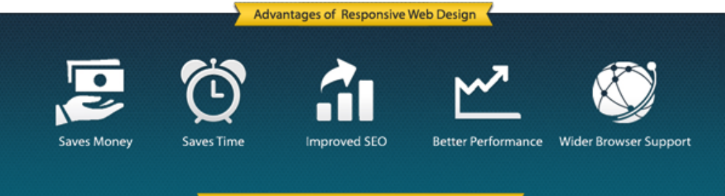
In summary, the one web solution can save you development time and money whilst improving customer experience.
- Generally Costs Less to Develop Than a Traditional Mobile and Desktop Web Combo
- Takes half as much maintenance Work
- Is Future-proof for New Form Factors
Kills Two Birds with One Stone By Improving Customer Experience for Both Mobile and Desktop Viewers