Category Archives: Blog

Why Creating a Mobile Website for Your Business is Important Now


You may be hearing a lot of hype surrounding the current way mobiles are being used, and you’re probably wondering what effects this will have on you, if any at all. The truth is, the hype is there for a reason, and as tablet and smartphone usage slowly overtakes standard desktop or laptop usage, a lot is being changed to better adapt to this new state of connectedness, and this also includes general business practices.

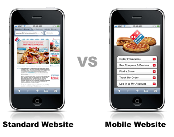
Currently though, the ‘mobile era’ is still new, and while mobile web usage is predicted to outnumber desktop usage by 2015, a lot of businesses have not yet adapted to these changes. This doesn’t mean they shouldn’t though- almost three quarters* of mobile web users will prefer a mobile friendly web-page over one more suited for the desktop, and seeing as mobile web usage is so high, this isn’t something that should be ignored by a business that makes use of their online profile.

By creating a mobile website for your business now, you’ll be putting yourself directly above any competition that fails to provide mobile catered content, and you’ll be in a position to stop yourself from falling behind any other businesses that have already adapted to mobile technology.
When mobile traffic is at such a high level, (ex: around 45% of users in the UK will use mobile to access the internet.) and customer satisfaction is key to building a successful business, creating a mobile website that works in a customer’s palm is incredibly important.
You may already have a nice desktop website, but if this doesn’t feel suitable for a mobile device, and it most likely doesn’t, then building a compatible mobile website for smartphones and tablets will be needed. By integrating a mobile version into your website, you’re giving yourself and your customers a much easier to use web page that leaves the customer with a pleasant experience they are going to remember.
A mobile web page will ensure quick loading times, no malfunctioning on desktop optimized code such as JavaScript, no issues with scrolling, and quick access to available content and contact info. If you don’t have this at a customer’s hands the moment he or she opens up your web page, they are likely to go elsewhere.

The sooner you get a mobile website up and running, the better- a lot of businesses are catching up with the times and you’ll want to provide content your competition doesn’t have before they get it themselves. Having a mobile website will ensure you stay at the top of the mobile tidal wave, and not at the bottom when it comes crashing down.

Mobile websites are THE best way to get your message across quickly


As a business, it’s important to be able to convey your services to potential customers quickly and ensure any questions they may have are answered appropriately. The place where customers will most likely rely on for information in this age is of course the internet, and while it’s important to get your name out there so you can be seen on the web, if you don’t do it right, it could backfire and end up turning potential customers away.

‘Not doing it right’ usually involves not providing information on your website that is easily readable and making navigation too complicated due to the website looking unfinished or cluttered.

When this happens, visitors of your website will often turn up, not find what they are looking for after a few seconds of browsing and then look elsewhere for a better displayed website.

While these days it can be easy to create a website with or without help from somebody with coding knowledge, the truth of the matter is that most current websites may not be suitable for mobile usage, and this is where a high amount of web traffic is happening, so without a mobile website for your business, your website will look cluttered on a mobile device no matter how good it looks on a desktop or laptop.

well-designed mobile website will be capable of displaying all the links and information visitors will need right on the first page. No extensive scrolling or zooming will be needed, and all of the text will be readable from a mobile screen.

On top of this, good mobile websites will load significantly faster than a website previously designed to work for PCs, and this along with the easy-to-read layout of the mobile website will ensure an extra few seconds to spare for any potential visitors to the website.

Although a few seconds quicker loading time and faster access to content doesn’t sound all that beneficial at first glance, when visitors are using their smartphone to access websites, they will be relying on quick access to content so they can find out what they need to know as soon as possible before getting on with their day.

If you can serve customers your business information, contact details, location and other important facts within seconds of loading, your customers will have all they need to know to make a purchase or order your service right away.

Using a mobile website will allow you to bring your potential customers all the information they need straight to them instead of making them search for it themselves which can be a painful task when using a mobile.

Mobile websites are often a preferred choice over apps as well. The main reasons for this being that potential customers do not need to wait for a download, they don’t need to search the app store, and they can have an app-like experience straight from their browser thanks to new technologies like HTML5.

How to Engage Your Site Viewers Through Mobile Web Pages

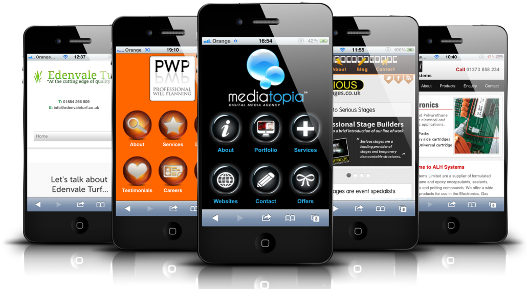
One of the great benefits of having a mobile website is being able to engage your site visitors through the use of built-in smartphone functionalities. With a well-made website, not only will you be able to showcase all of the information necessary for a potential customer in lightning quick speed, but you’ll also be able to embed widget-like functions that can be accessed with a smartphone.

For example- You could embed a click to call function that can be activated when viewing your business’ contact details. This will allow potential customers to call you with the tap of a button instead of writing down the number, leaving the website and then opening up the dialer and dialing in the number. This will make things a lot faster for potential customers and it’s a feature that, although simple-sounding, can be used to make a much greater impression on your overall website.

There are many other features and functionalities that could be inserted into your website to help your visitors make the most of it. Once again, all of these features help speed up browsing time by allowing visitors to replace the long, dull manual tasks with tasks that can be completed automatically by their smartphones.

Another good example is having a built-in mapping function within your mobile website- If you have a physical location; you could use this mapping function to allow users to check where you are and how to get to you from their location. This would allow them to stay focused on other important information on the app whilst quickly taking a look at the map every time they need an update on how close they are to you.

There are a lot of other features that can be used to help make your mobile website work well alongside smartphones and tablets, and a lot of these functions are key to engaging your site visitors and allowing them access to everything they need to know about your business within seconds.

Now that a very large number of people have access to smartphones, many people have started to adapt to the fast-paced nature that a smartphone can send and receive data, and because of this many people will have low attention spans and will turn down something they may be interested in because they are too lazy at that moment to manually gather information, make calls or check locations. This is where built-in mobile web functions can really help to improve your website, and it’s one of the many reasons why mobile websites stand out from standardized websites previously designed just for desktop and laptop PCs.